For our OTS's main title we used was Times New Roman.
We used this font due to the fact it provides a 'vintage' feel to our OTS. This is effective as we are making a periodically set sequence set in an Victorian themed setting. The font links in with the the time setting due to it looking quite old fashioned therefore it allows the audience to link the two factors together.
Additionally, we noticed when analyzing other horror films we noticed a general trend that this font was used, therefore by using this font in our sequence it can be clearly linked to the horror genre.
Additionally, by using the Scarlet texture on the font it created a more aesthetically appealing title as it has a shaded red feature which the audience would clearly link to danger upon seeing it.
MW
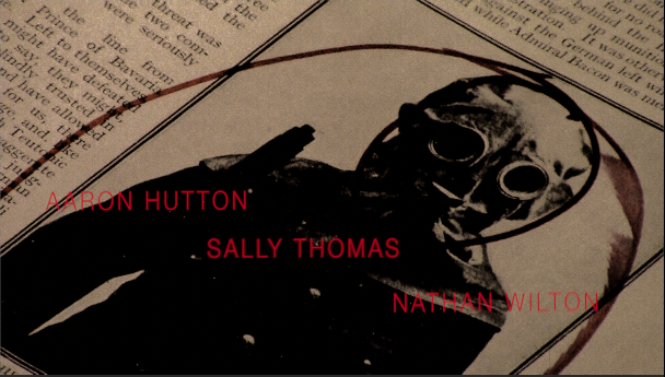
For the rest of our OTS's title sequence we used the font Helvetica Neue.
We used this because of it's aesthetics, similarly to the font used in Se7en this font looks quite faded, this effect the font gave off was effective to use as it didn't stood out from what is happening in the background so the audience clearly see what is appearing onscreen. Additionally, it has quite a rough, rustic look which gives the OTS a gritty darker appearance which is needed to portray the dark themes we wanted to show onscreen.
We used this font with the Designer Thin effect, this makes the font appear thinner than it was originally, this was effective for our opening as it allowed more of what is happening in the background to be seen. It could also be interpreted that the long text relates to how our main character is watching over all the women he is looking at in the opening title sequence.
MW